Skip to main contentDefinition
The Heex Analytics Dashboard provides a real-time overview of all events generated by your systems. Use it to analyze and optimize your fleet’s performance. With key metrics, interactive charts, and customizable filters, you can easily identify issues and share insights with your team for faster resolution.
Root Cause Analysis
Key results
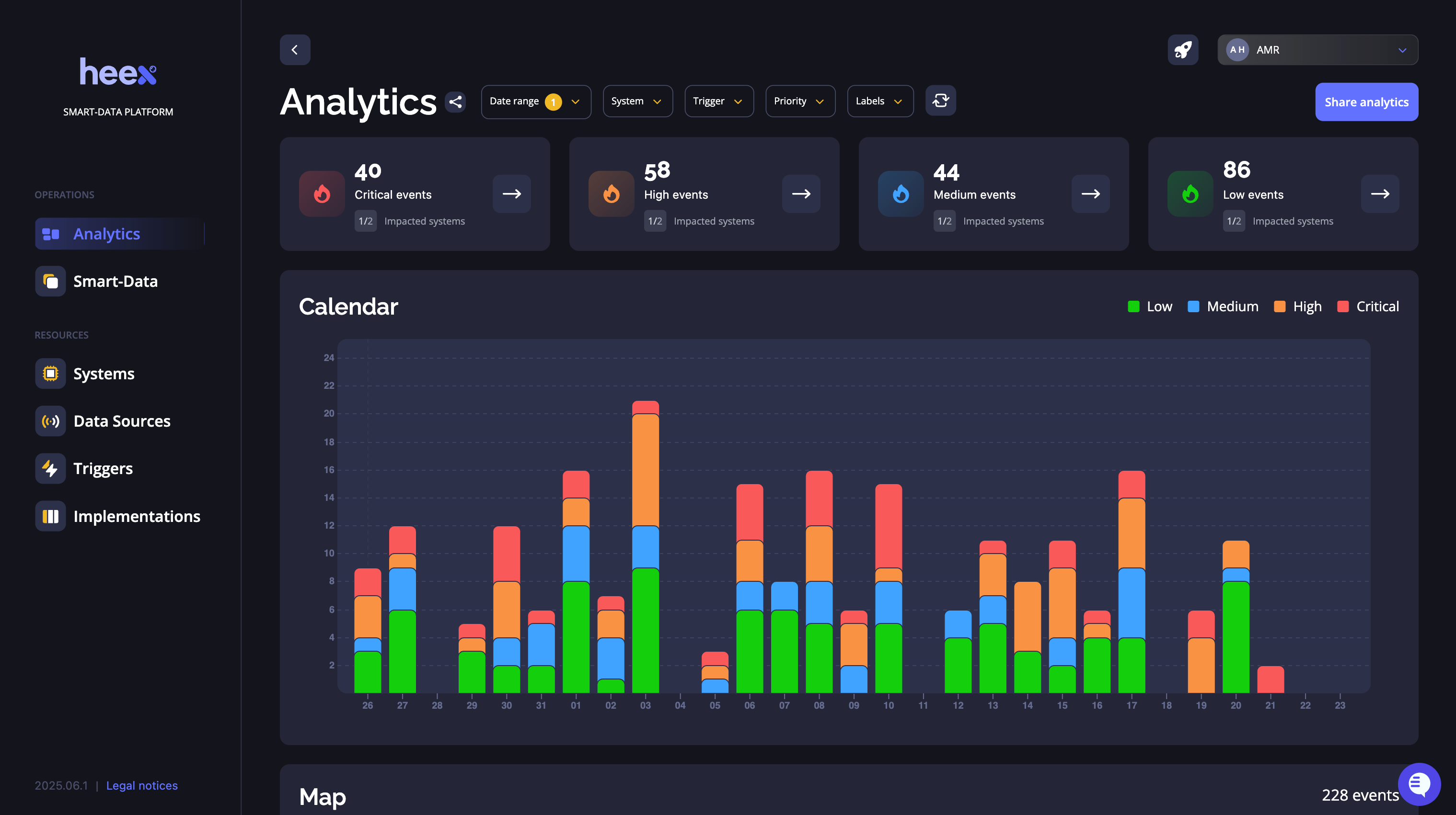
At the top of the analytics, you’ll see key results that give you a quick snapshot of your operations, helping you understand them in less than a minute.
- Critical events: Shows the total number of events triggered with critical priority, giving you a single metric to know if everything is good. Link to trigger priority title
- Percentage of critical events: This metric compares critical events to the total event count, offering a better view of your fleet’s operations and the impact of high-priority issues.
- Problematic systems: Displays the number of systems that have generated critical events, helping you understand if issues are concentrated on a few systems or spread across your fleet.
- Other priority events: On the right, you’ll see counts for high, medium, and low-priority events, providing a complete view of your fleet’s activities.
Fault domain isolation
Filters and charts allow you to explore and filter issues using different views, such as calendars, maps, or system data. It provides you all you need to isolate the root cause of issues.
Top filters
Period and date range
To analyze your fleet, you will focus on a specific time range. For this, we give you two selectors:
- Period selectors: To analyze your operations by minutes, by days, by weeks, by months, or even by years. It impacts the date range and the calendar chart.
- Date range: To select the starting and ending date of your analysis.
Other filters
At the top of the analytics dashboard, you will find the filters of the application. Use them to filter the analytics key results and charts by what is interesting to you and your team.
For example, you can focus on your systems, on specific triggers or on specific labels. This help you to focus on what matters.
link to filters definition
Calendars
Calendars show you the number of events per period selected in the chosen date range, split by priority.
You can click on a period to filter key results and other charts by the specific period.
Maps
Maps show you the number of events per location. When zooming, events are split in more precise locations and key results and charts are updated corresponding to events on the maps.
Preview results
Events list
Once you isolate data you want, you can preview events. This allows you to view the list of events and more details about them. To do it, you just have to click on the number of event cards. You will see events listed by priority.
Event detail
To see the details of an event, you can click on “see details”. The event column will be opened on top of the list, showing you the context of the event, metadata, and recordings.
Collaboration
Share analytics
To share analytics, you can click on the “share analytics” button. It will open a modal to enter email of people you want to send the analytics. They should be in the workspace. Validating will send an email with the link of the analytics in the state of the sharing.