Documentation Index
Fetch the complete documentation index at: https://doc.heex.io/llms.txt
Use this file to discover all available pages before exploring further.
Definition
The Heex Analytics Dashboard provides a real-time overview of all events generated by your systems. Use it to analyze and optimize your fleet’s performance. With key metrics, interactive charts, and customizable filters, you can easily identify issues and share insights with your team for faster resolution.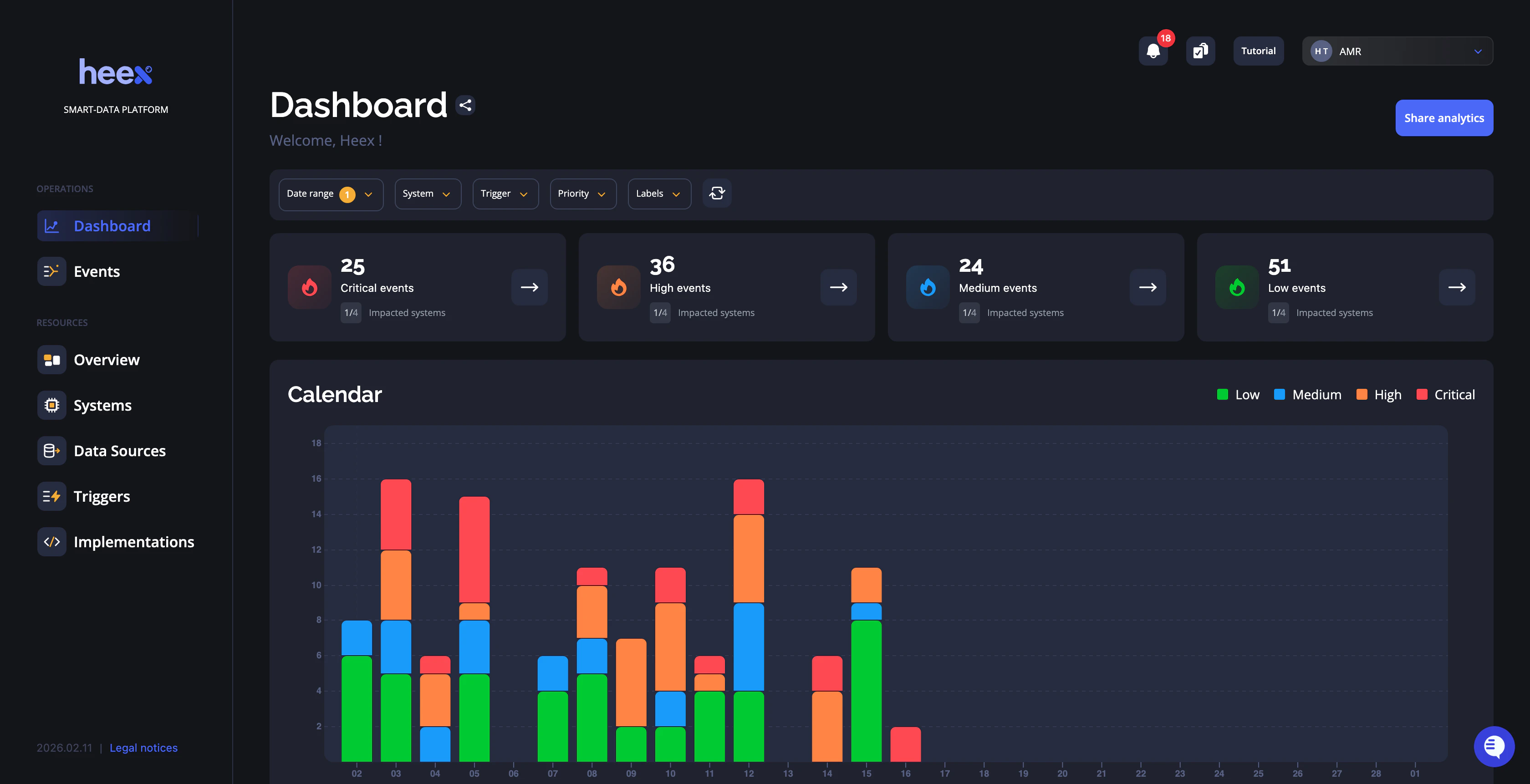
Root Cause Analysis
Key results
At the top of the analytics, you’ll see key results that give you a quick snapshot of your operations, helping you understand them in less than a minute.- Critical events: Shows the total number of events triggered with critical priority, giving you a single metric to know if everything is good. Link to trigger priority title
- Percentage of critical events: This metric compares critical events to the total event count, offering a better view of your fleet’s operations and the impact of high-priority issues.
- Problematic systems: Displays the number of systems that have generated critical events, helping you understand if issues are concentrated on a few systems or spread across your fleet.
- Other priority events: On the right, you’ll see counts for high, medium, and low-priority events, providing a complete view of your fleet’s activities.
Fault domain isolation
Filters and charts allow you to explore and filter issues using different views, such as calendars, maps, or system data. It provides you all you need to isolate the root cause of issues.Top filters
Period and date range To analyze your fleet, you will focus on a specific time range. For this, we give you two selectors:- Period selectors: To analyze your operations by minutes, by days, by weeks, by months, or even by years. It impacts the date range and the calendar chart.
- Date range: To select the starting and ending date of your analysis.